Sarah Murad
A mask store that sells various styles of masks, and a brand that emphasises unity in the wake of covid-19
In the year 2020, many people have been isolated and confined to their homes. Covid-19 has separated people from their loved ones, prevented people from doing their favourite activities and taken away their freedom. The only way one is ever able to go out, talk to people face-to-face or even enter an establishment is by wearing a mask. Many people despise these preventative measures because they feel like it only furthers the isolation they’re experiencing and reminds them of their stolen freedom, thus they are fighting against wearing masks as a way of protesting. Amidst all the strife, people need a way to remember that we are wearing masks to fight against this virus together.
Create a mask brand and store that doesn’t only aim to sell, but emphasises togetherness and unity, viewing masks as a way to unite against Covid-19, instead of a barrier to freedom. Create a community for people to share their struggles, give each other advice and look forward towards a better future. A community of people that want the world to be better again. A community of change.
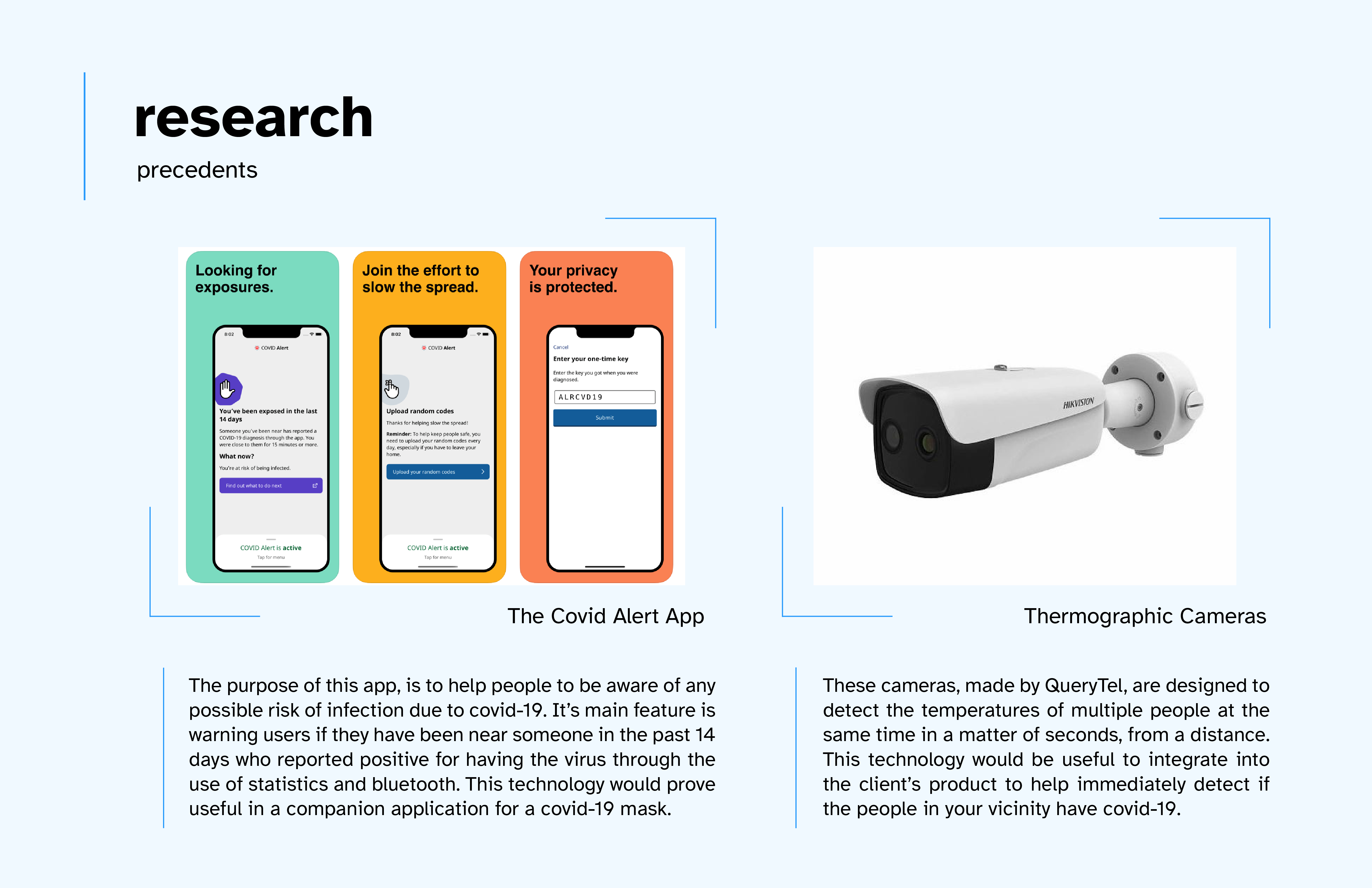
These two precendants are:
As I was brainstorming potential features of the app and the masks themselves, I stumbled across these two precedents and found that the features they have could apply to Arisen. The Covid Alert App alerts people if they've come into contact with people who are infected with covid-19, which is a useful feature to have in a potential companion app for the masks. The thermographic cameras can detect the temperature of multiple people from far away, which is the technology I would need to have integrated into the masks to detect if people around me are ill.
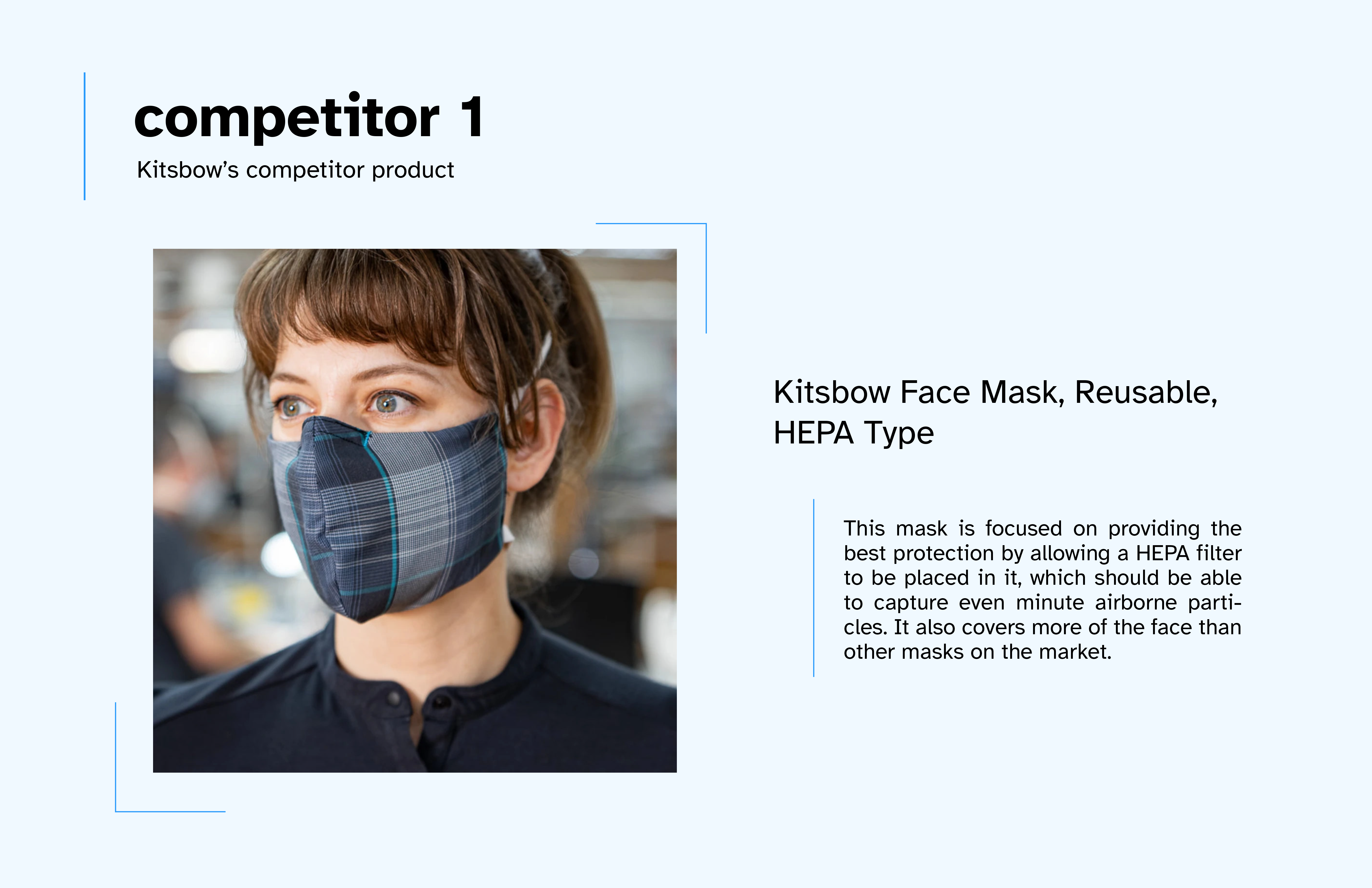
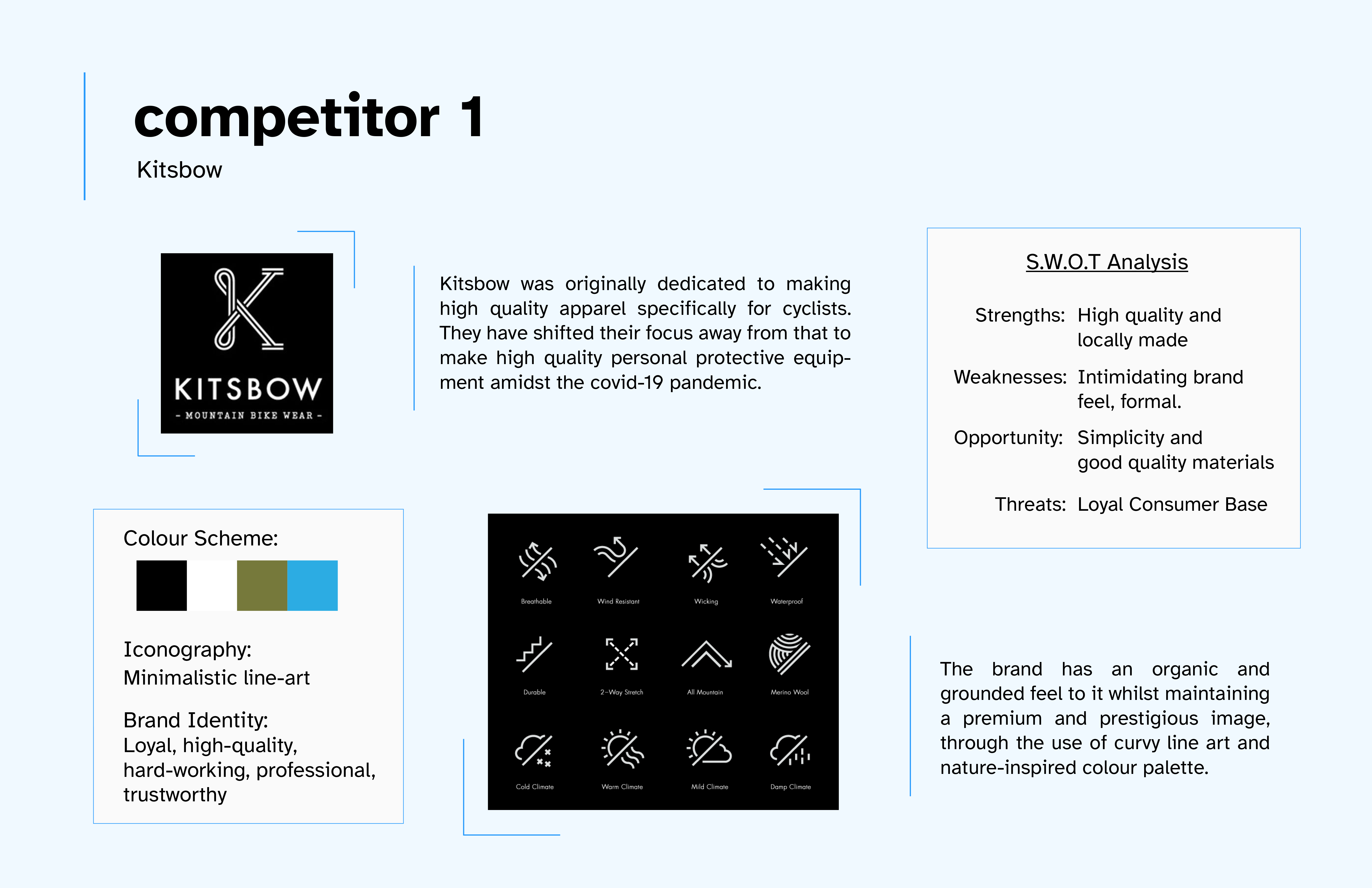
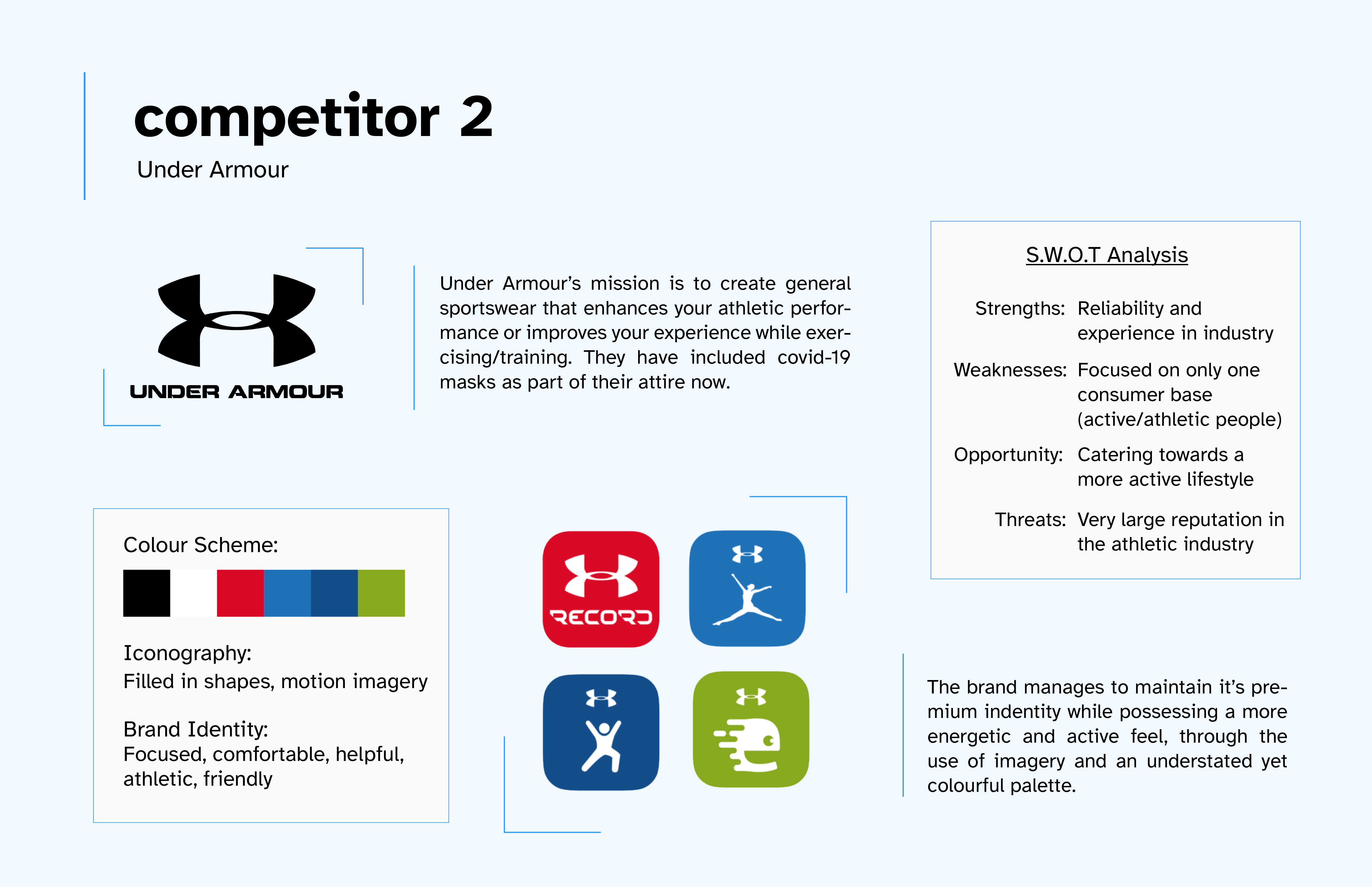
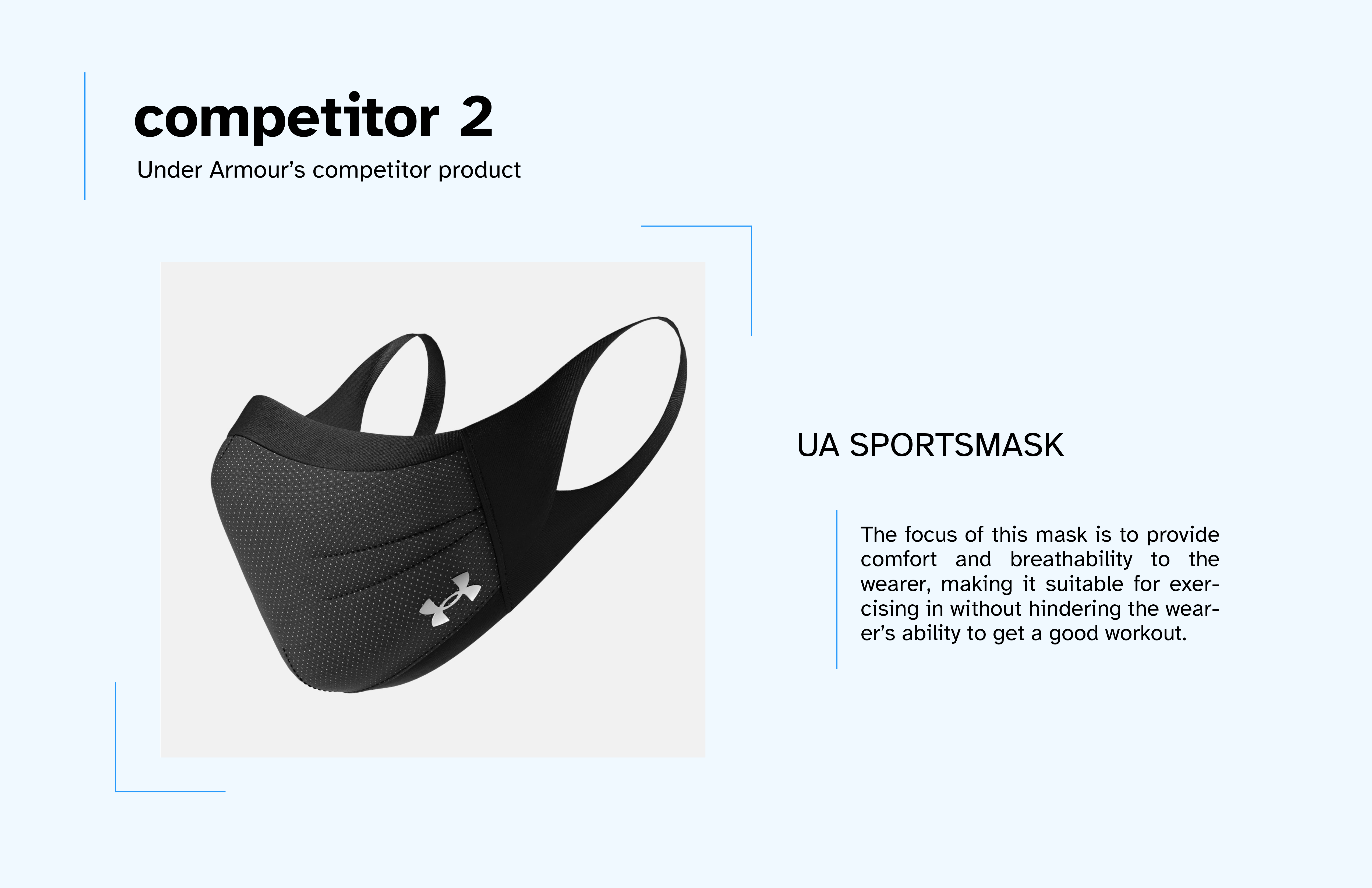
The purpose of analysing my competitors is to understand what is already out there in the market, why they're successful, what mistakes they're making, and how I can apply this to my company. Here I have two competitors, both being mask companies but also having their own unique attributes that set them apart. Kitsbow focuses on comfort with style and Under Armour focuses on breathability and minimal design.
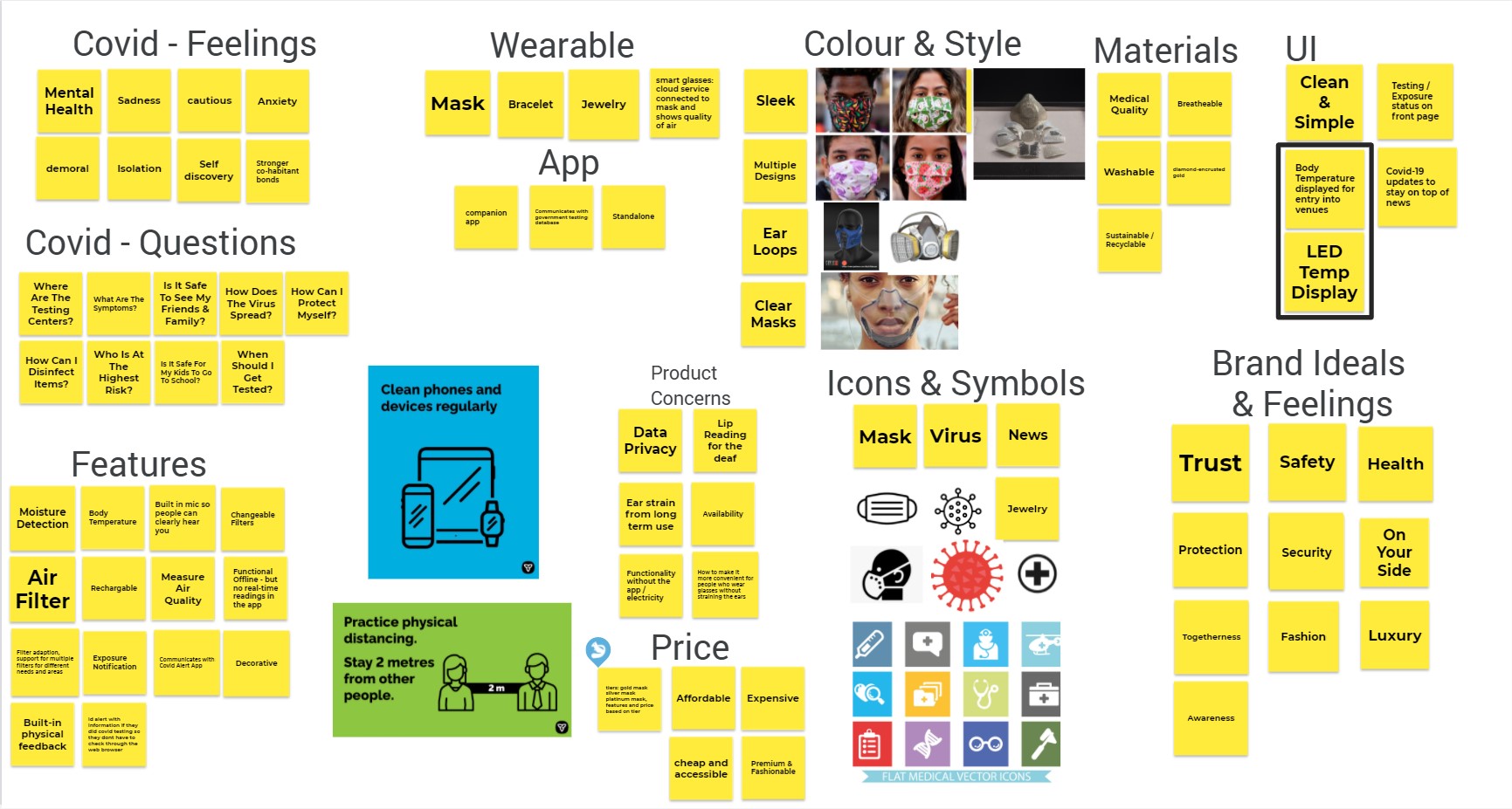
I knew I wanted to develop a covid-19 mask brand, so I started with a few overarching subjects, like covid, wearables, and masks. I asked myself vague questions like, how did people feel about covid? What do people ask themselves about covid? After that I ventured into more specific brand questions like, what type of features and style should the masks have? What type of feeling do I want my brand to portray? This helped me narrow down some ideas about my brand, the UI, the motivation and even some concerns about the potential product.
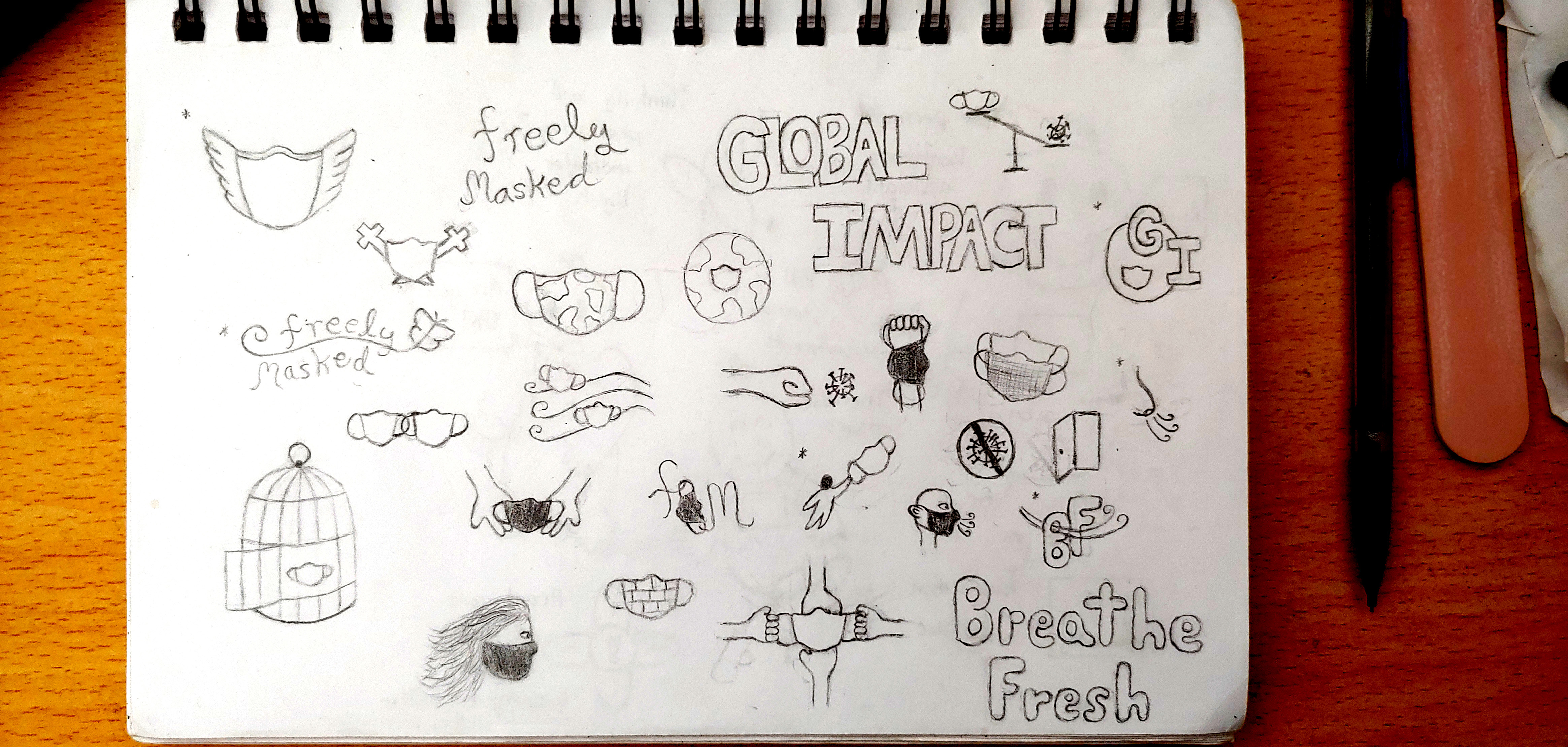
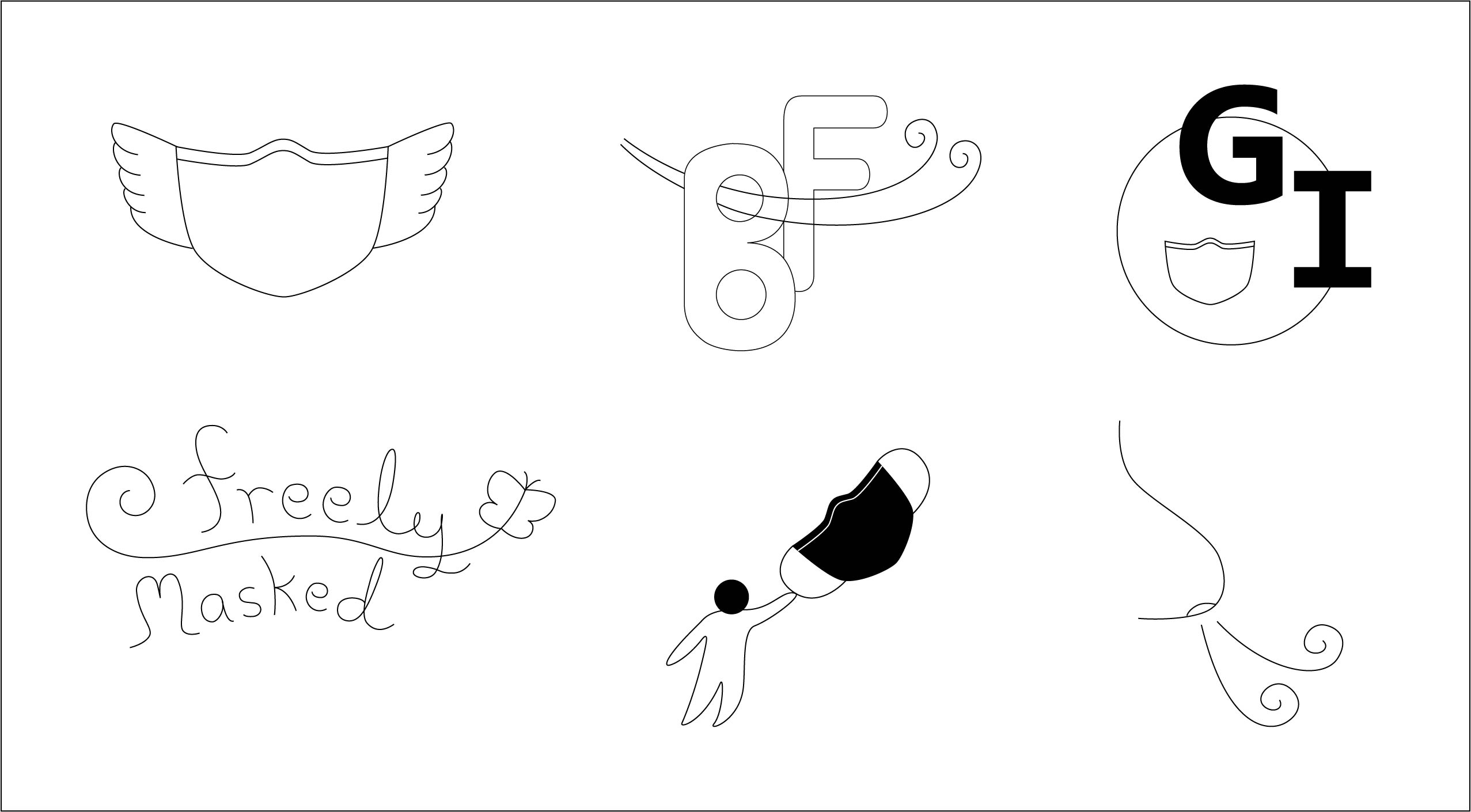
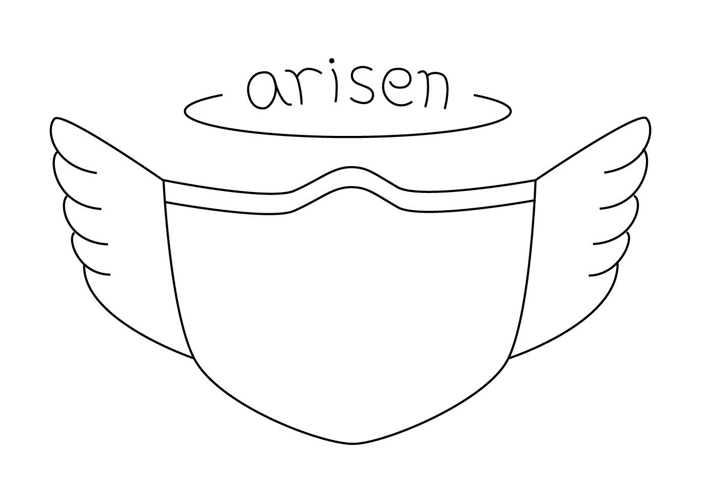
I moved onto ideating for the brand and the logo, coming up with three different brands in the process: Freely masked, Global Impact, and Breathe Fresh. They were based upon my brand's anticipated themes: freedom, togetherness, strength, unity, comfort and friendliness. Respectively, Freely Masked has a more line-art style to it and emphasized friendliness, freedom, and playfulness. Global impact had a blocky, rectangular style and was more bold, firm, and strong. Breathe Fresh used a lot of round shapes was more bubbly and comfortable. With some input from my professor and colleagues, I ended picking a couple logos from each brand to iterate on, ultimately deciding on the top-leftmost logo in the Image 2. This logo originally belonged to the Freely Masked brand, though my professor gave me a piece of advice that the name I chose may be a bit too wordy, and suggested to go back to the drawing board for a different name to go with the logo. After doing many name iterations, I decided on the name Arisen. This was for a few reasons:
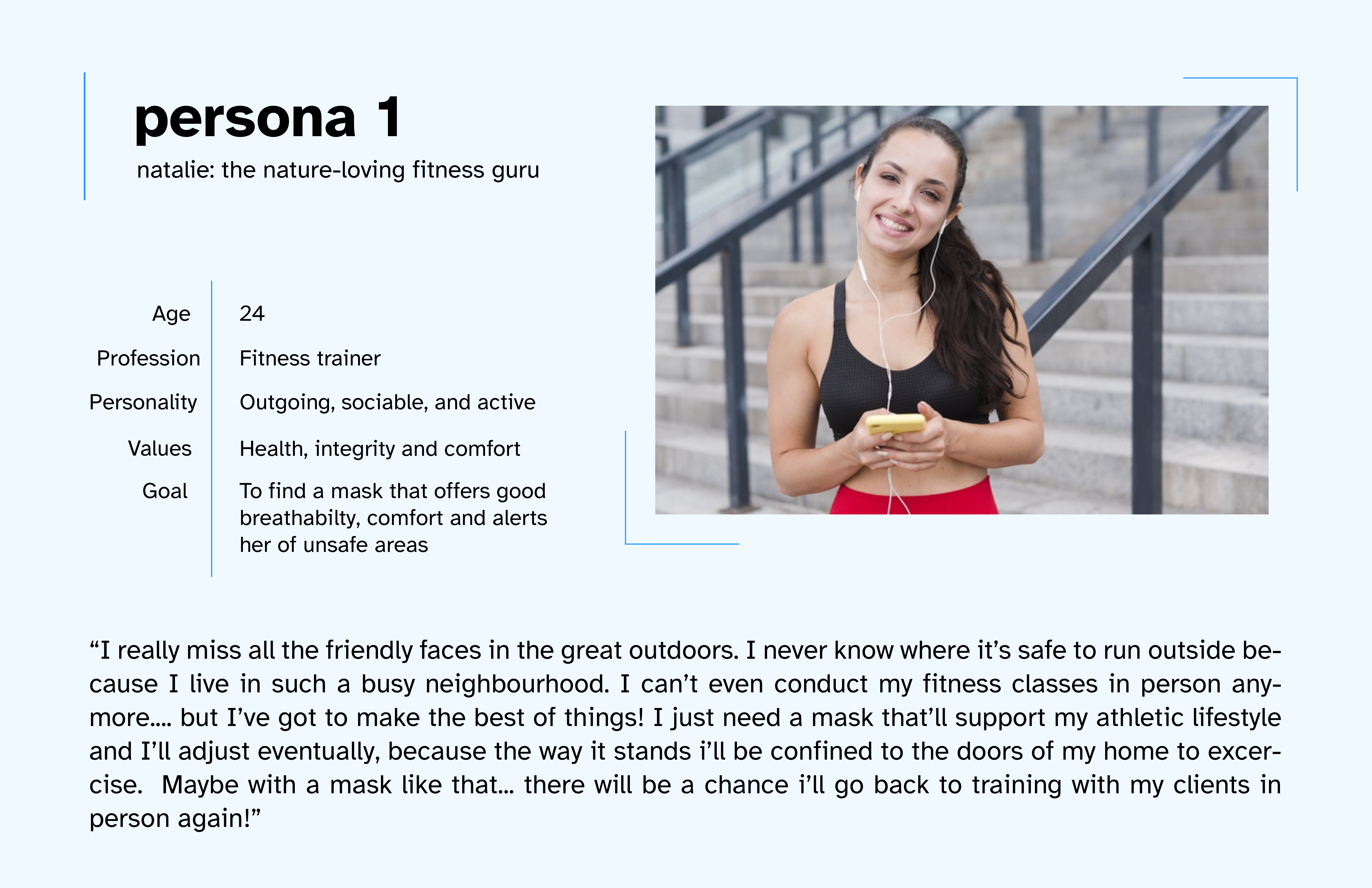
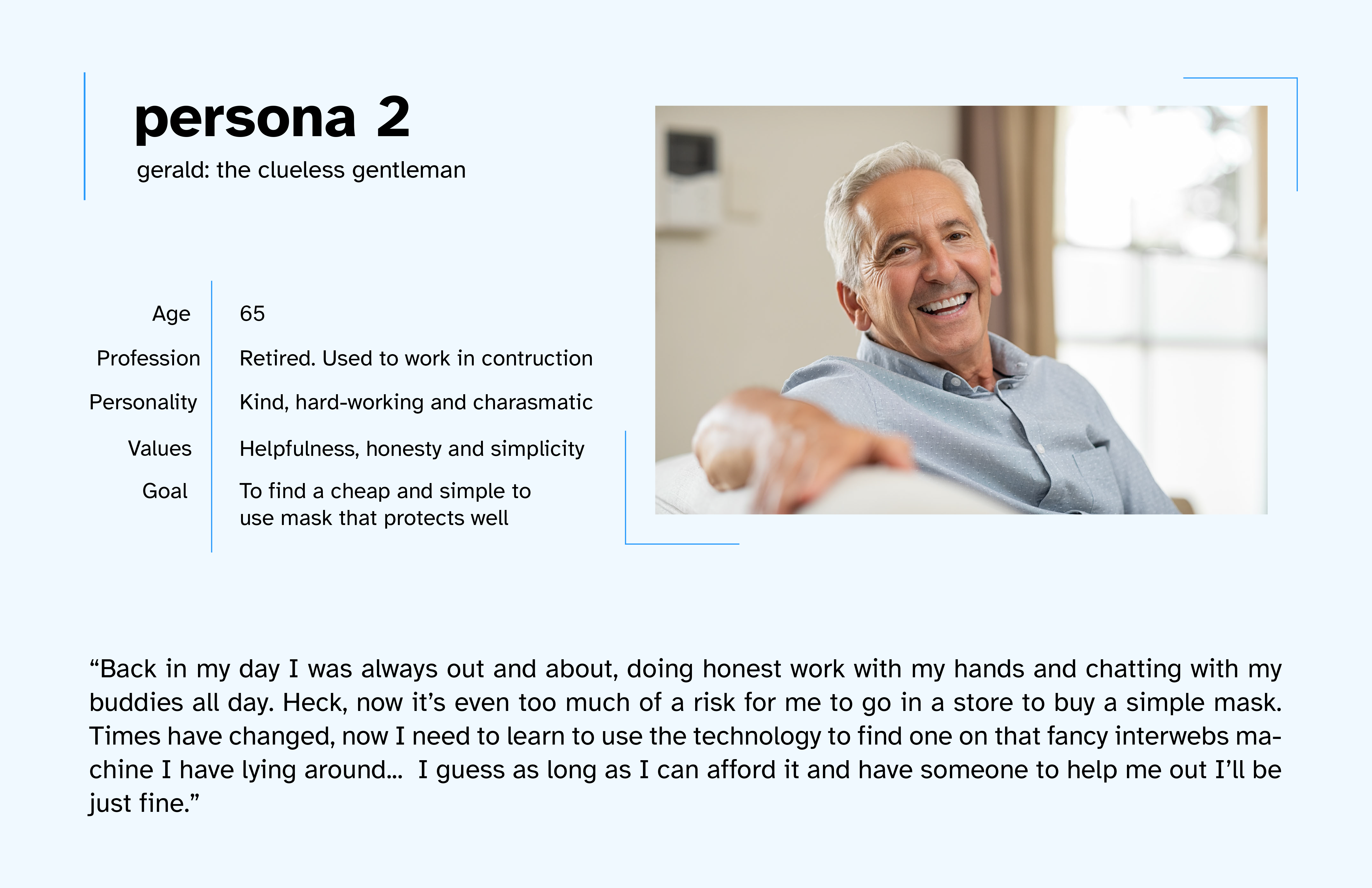
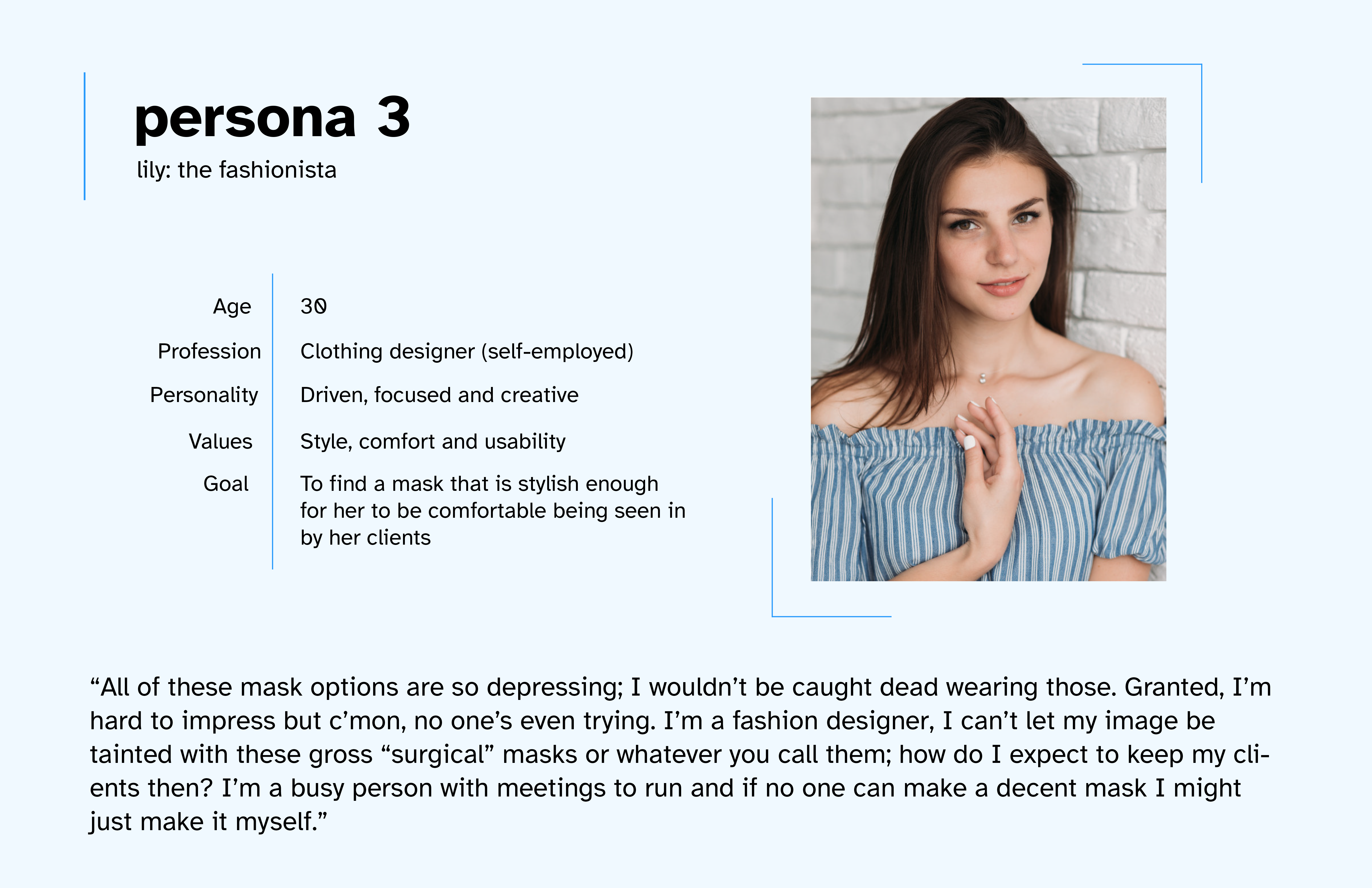
I made three distinctly different personas to understand the feelings and needs of different potential audiences for my product.
Making these personas helped me see that I needed my mask company applicable to people of so many ages and backgrounds, all with different needs and goals in their own lives. Finding something that can appeal to all of them and address their concerns was definitely a challenge but I was up to the task!
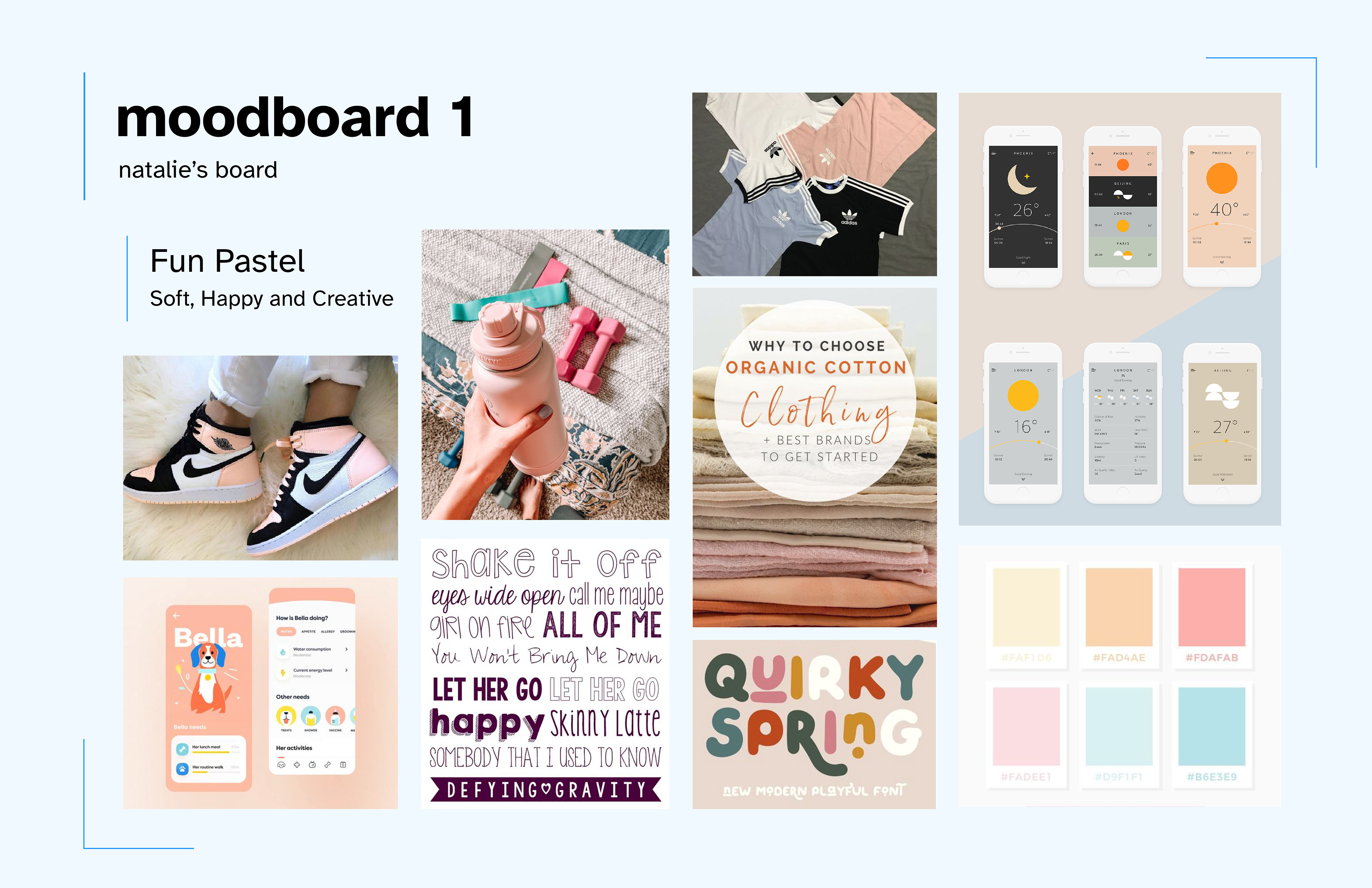
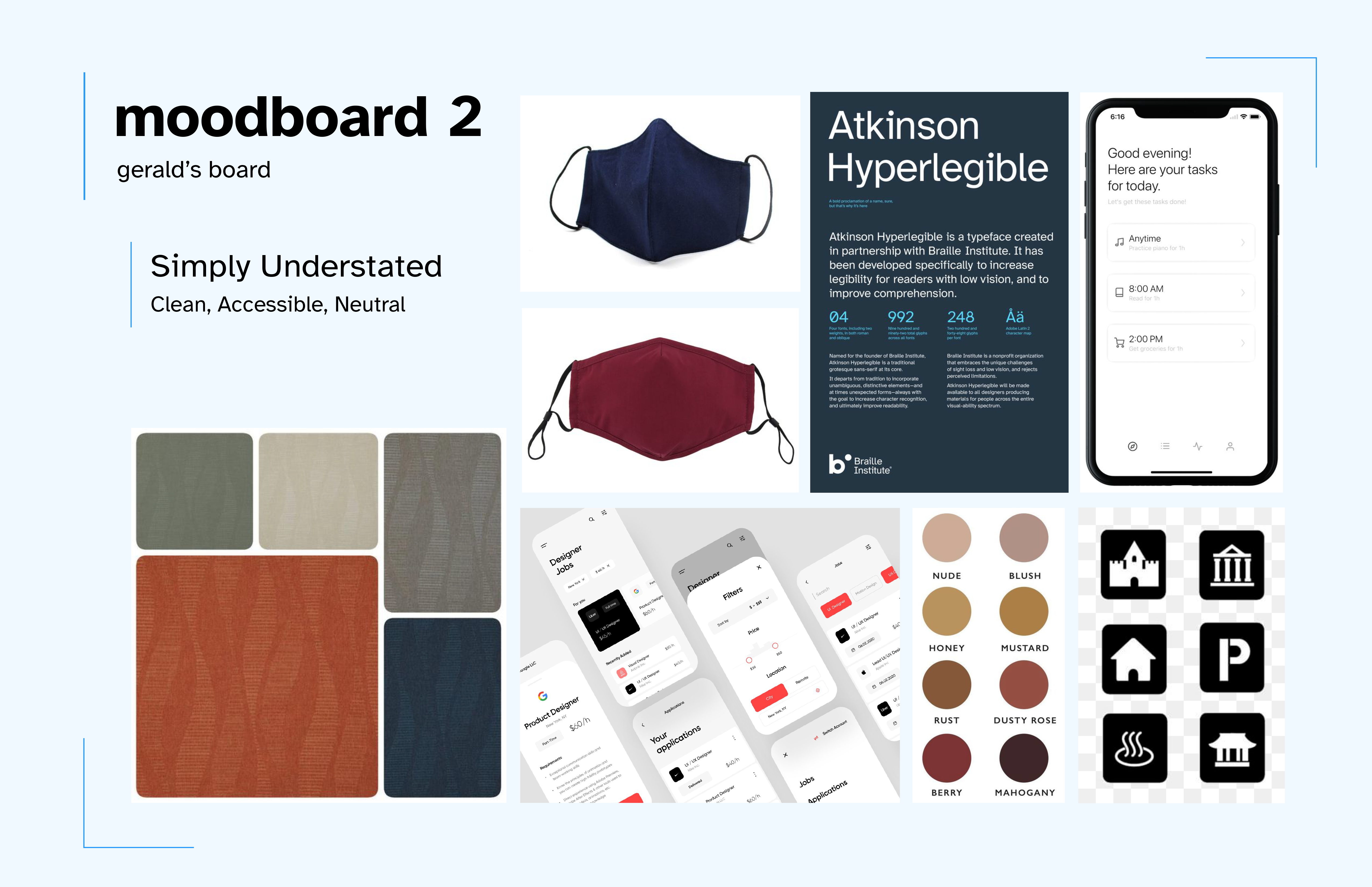
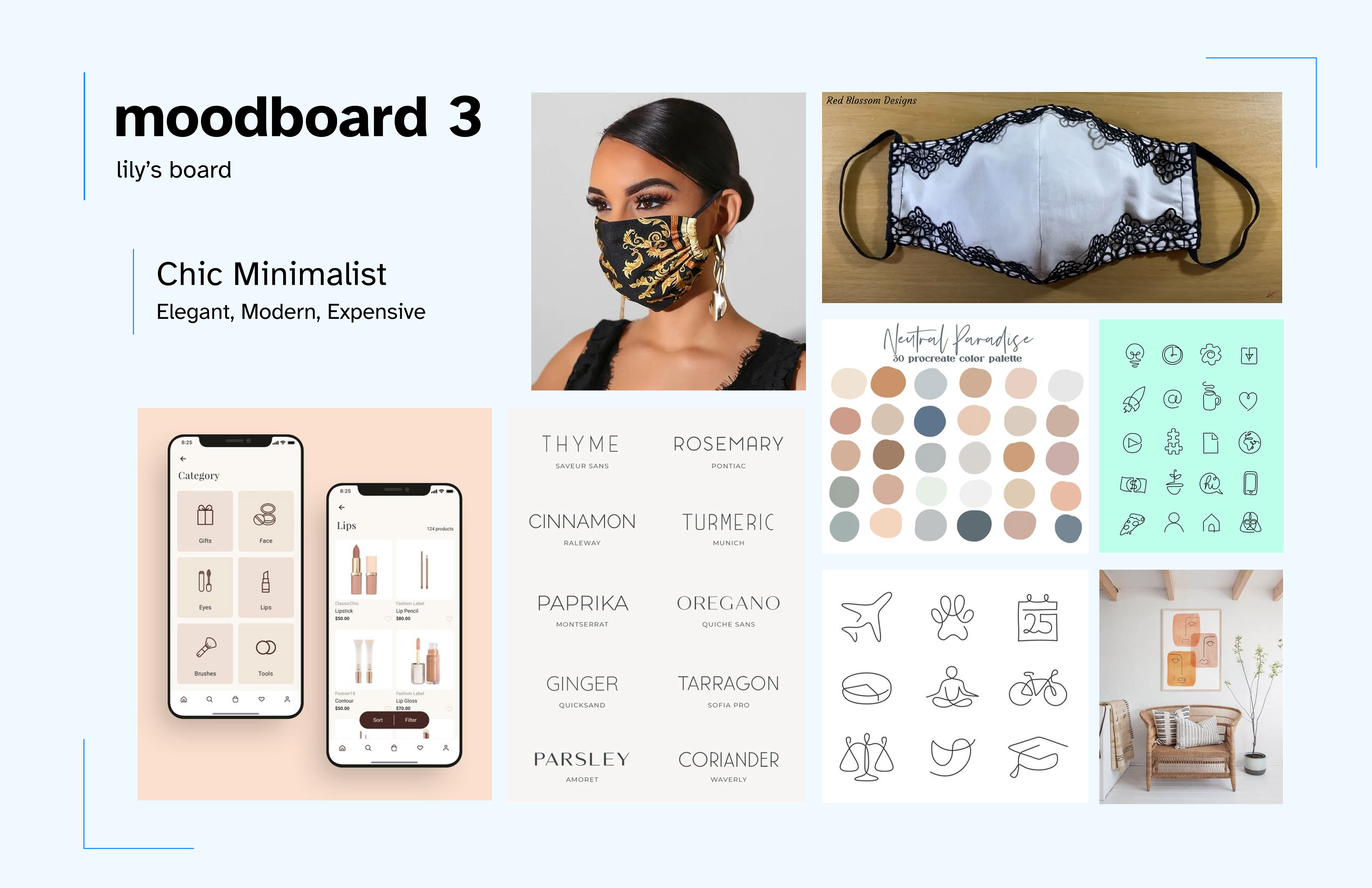
Moving forward with those personas, I decided to make moodboards inspired by each one and what would suit them the most, respectively.
I settled on the Simply Understated board moving forward, because I felt like catering to a wide range of consumers (from kids to elderly) was of the utmost priority for a mask brand. Going the route of being accessible means sacrificing some stylistic choices, however I think it's a worthy tradeoff. I did however, decide to keep the iconography for chic minimalist as inspiration, albeit simplified in the final product, because the rounded line-art style fits well with my logo and the friendliness of my brand.
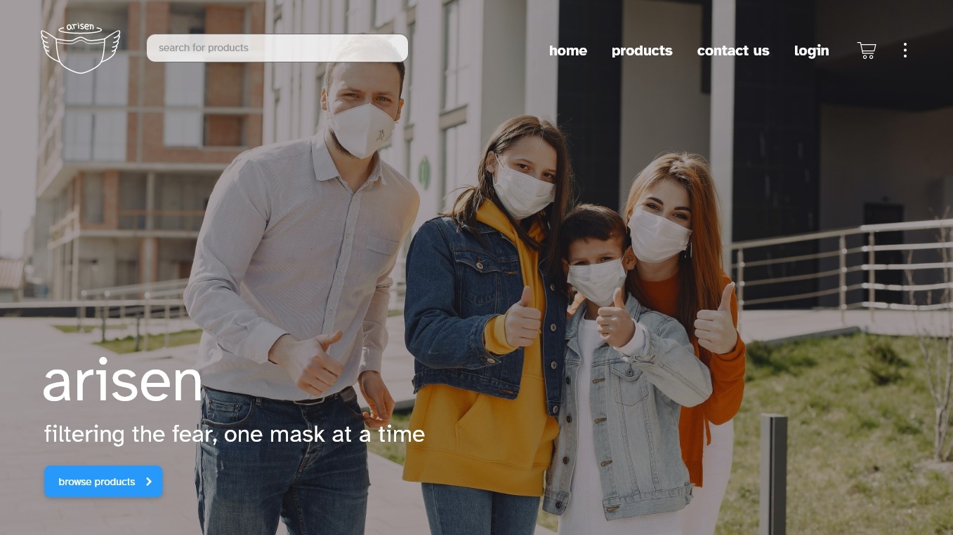
For my UI design, I went for a blue palette as it is the most accessible colour for all people (including colourblind people), and also because it gives a calming feeling. For the Icons, I stuck to rounded corners where possible to convey a feeling of friendliness and a softer, inviting tone. I went for a font specifically tailored to be very readable. I also chose to use lowercase font for my logo and heading text to really take the inviting and friendly nature of my brand to the next level.
* Best viewing experience on desktop! Click images to enter focus mode, then hover to pan the wireframes. Click outside images to exit focus mode. On mobile, focus mode is not supported. You can pinch to zoom in on the image instead.
Flow 1 is browsing products. The user is greeted with the brand and its' slogan, with an accompanying graphic and an action button to prompt them to browse through the mask selection (taking them to the products page). The navigation bar on the top allows them to navigate to the about, products, contact us, login, and checkout pages, as well as search for any product on the site. As the user scrolls down, the second panel of the homepage contains a greeting video that portrays Arisen's community and values. The third panel is an infographic explaining how Arisen's mask effectiveness is evaluated to guarantee proper efficacy. The fourth panel that showcases current popular mask styles. The last panel on the home page is another call to action that prompts the user to browse and find a mask that suits them. After clicking on this button, they will then be redirected to the products page.
On the products page, users can browse through masks based on their filter preferences. In this example I have adult masks, kids masks, face shields and mask filters selected. The items are shown in a carousel format, allowing the user to click the arrows to navigate through the the full item selection for each category. Each item card contains a picture of the item and a button which takes the user to the product details page of that respective item.
Flow 3 is making an account and logging into the website. The first page here is the log in page which has two fields for email and password, a button in case the user forgot their password, and then a log in (submission) button in order to complete the process. There's also a text box advertising the advantages of making an account, and a link to the sign up page. Assuming the user doesn't already have an account, they would then click on the "sign me up!" link to then be redirected to the sign up page. Here, the users are prompted to enter their name, email and password. There is also some password requirements listed for extra security and a checkbox that asks the user if they want to receive email notifications for deals and the monthly newsletter. When the user has filled in all the fields, they can click sign up to make the account. They would be automatically logged in afterwards. The user in this example is Melinda, and on the the third image we can see her profile page. It displays a profile picture along with listing her personal info and links to change said pieces of info as well. It also contains a notification setting checklist she can adjust and an unsubscribe option. Upon scrolling down she can also cards that lead to to payment info and delivery/order screens.
This last page is just the contact us page, which has info about the Arisen company's location, a map, and a help notification form for users that need help with anything.
Flow 2 is adding an item to your cart and going through the checkout process. In the first page, we see that the user has nothing in their cart. Then we skip over to them having selected an item and gone to the product details page. On this page contains a description of the product, offers a few options such as size and quantity, and then allows the user to add the item to their card. It also presents them with other styles of masks that they may be interested in. After the user adds the product to their cart, a little blue symbol appears next to the cart icon, as a confirmation it has been added successfully. The user than navigates to the cart icon, which takes them to the confirm cart page. Here they can view a cart summary, make changes to the size and quantity of an item, or even remove the item from their cart. Once the user is certain they want to go ahead with the purchase, they can click on the "to checkout" button, which takes them to the checkout page. Here they can enter in their payment and personal info to complete the transaction.
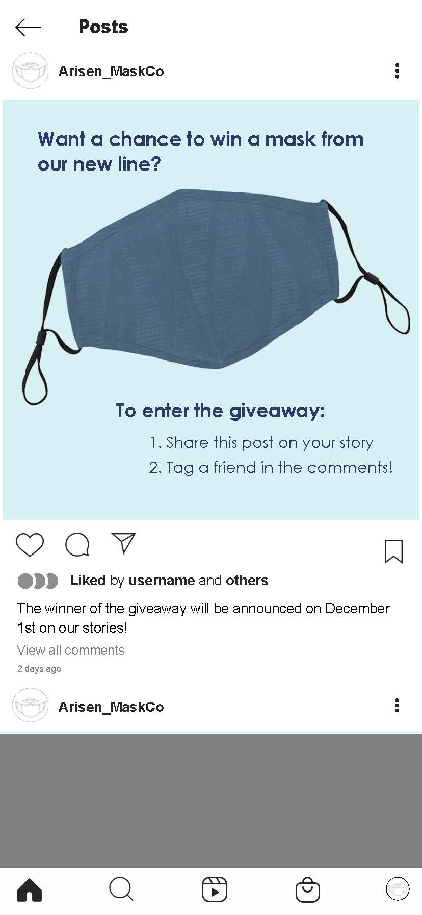
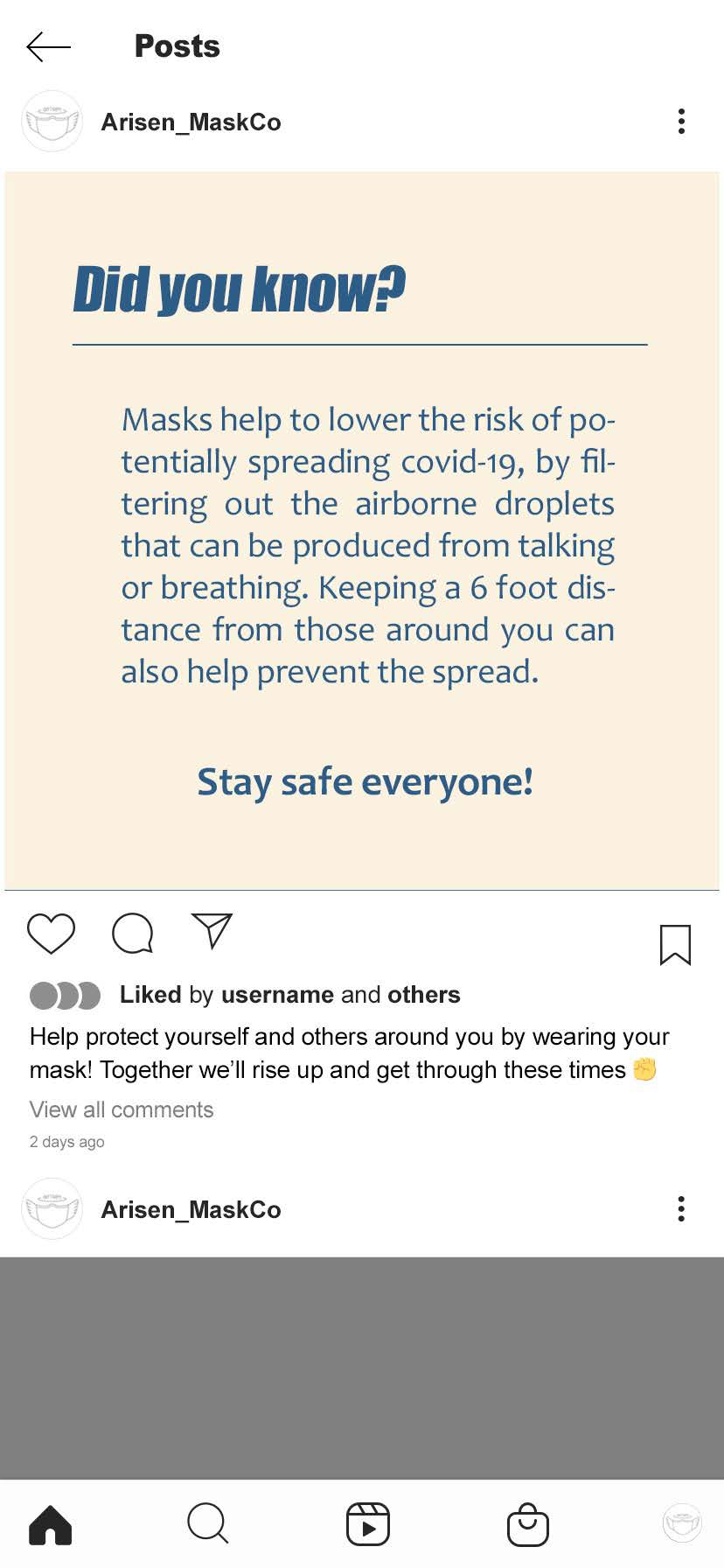
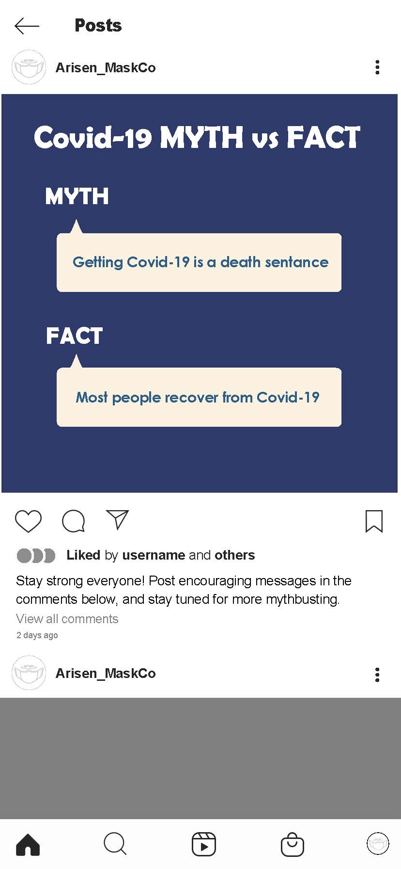
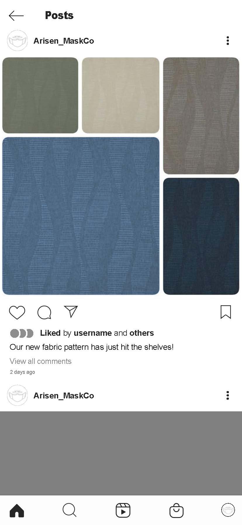
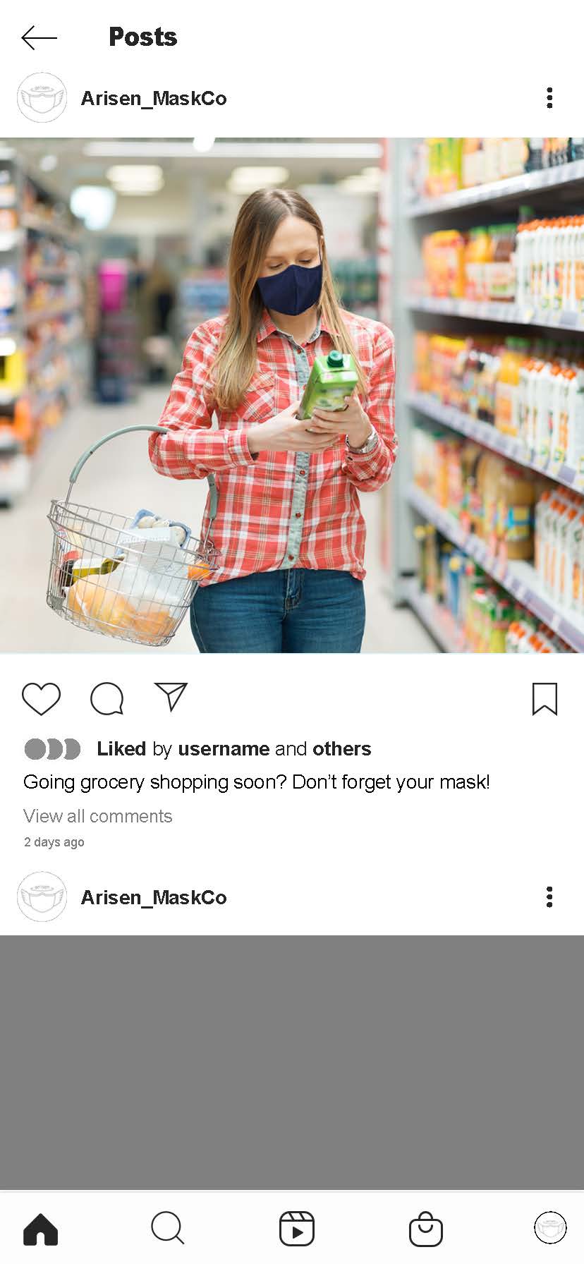
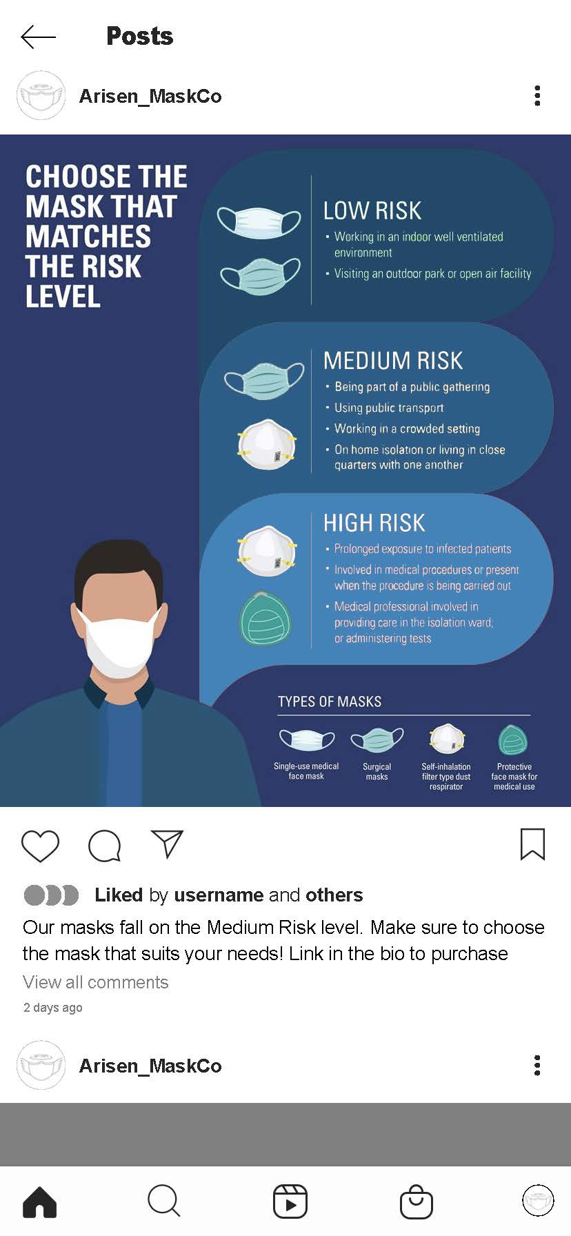
If my brand were truly aiming to foster a community of change, it has to have a platform to reach out to said community, as well as allow people within it to share their thoughts and opinions with each other. What better way to accomplish that than through social media? So I set out to make a conceptual Instagram profile, along with some sample social media posts. I wanted to showcase the personality of the brand and how the company would communicate with their audience.
I'd like to take a crack at doing some UX motion to liven up these wireframes. Instead of just reading through the flow and looking at the screens, I'd like to animate someone going through the motions of each one!